




.png)
Adversity
Kaitlyn Voorhorst
Colored Pencil, 2023
This colored pencil project is called Adversity, and it holds a deep personal meaning for me. It depicts a figure who has made her way through a dark corridor to reach a bright sky. This mirrors a person in my life who was really struggling a few years ago. She was in a dark place, no one could help her but herself. I am so proud that she made it out the other side, and I know that if she ever finds herself in that dark corridor again, she’ll be able to find her own way out again.
Space is the element used to describe the emptiness around an object. I used space in the open sky and the end of the corridor. You have the dark and narrow corridor contrasted against the bright, big sky. Movement is present on this piece in the way your eyes get drawn down that hallway then it opens into the sky. I have done this to illustrate the claustrophobia and hopelessness of being in that place, and then the relief that comes when you know that you’ve made it through.
.jpeg)

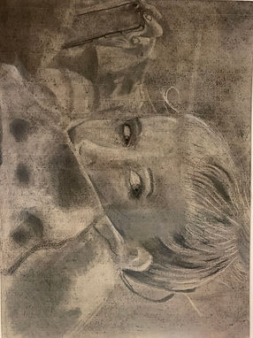
Safe Space, Only for a While
Kaitlyn Voorhorst
Charcoal, 2022
This piece is called Safe Space, Only for a While, and was made in the medium charcoal. This work is important to me because I’ve always felt safest at home. But home is only a temporary place, you must go and do other things. That is what my title means, only for a while. The reference picture that I used was taken by one of my sisters on a lazy Sunday afternoon, probably just after we had gotten done goofing off. I used this photo because I felt it was the one that most captured how it felt to be at home, safe.
Line was a very important aspect of creating this piece, even though you might not be able to recognize them. Line was one of the reasons I struggled with this artwork, when you’re working with charcoal is hard to get clear, defined lines to work from. It all must be shaded to a gradient. Value was another important piece of this art; you can see this element everywhere within this piece. To strike the correct value when working with charcoal is no easy feat, it takes a lot of erasing, careful drawing, and probably more erasing. Proportion when working with a human subject is especially interesting, if something is just an inch off, you will notice that it looks wrong. Problem is that most times you just can’t find whatever it wrong with it! Contrast was much like value in this piece, you can see it most in the subject’s hair, light and dark elements, when placed next to each other are almost always guaranteed to catch your eye.
.png)
.png)
.png)
Kaitlyn Voorhorst
11th
Digital art
This piece is named Why?, in the digital medium. I chose this name because all three of the pieces have nothing much to do with each other. The first piece of graffiti is the sun jumping rope. I imagine this piece to be one you might find in a whimsical, city funded, mural. This picture would be right at home in the sunny summers of cartoon land. When making this piece I originally was going to make a flower, so you might see some traces of that image in the rays of the sun. Once I had just the smiling sun on the page, I thought to myself, he needs to be doing something. Then I thought, what’s the most illogical action I can think of for a sun to be doing? I was my classmate who came up with the idea of a jump rope. The second image is a hockey puck that had just gotten hit by a dazed stick. Again, something that wouldn’t be out of place in a fun mural. I’ve had a recent fascination with the sport of hocky, watching the games where the puck just goes flying up and down the ice, sometimes with 100 plus mile per hour swings, and had a thought. What would that puck be feeling? My second thought was nauseous, but I eventually settled on ecstatic. It’s doing its job, isn’t it? What could be more fulfilling? This stick was a little more challenging, I had many ideas of what it could be feeling I decided on dazed, since it did just get hit in the face very hard. The tough part was showing it, I struggled to get the right colors and shapes above its head to show that it was dazed. I turned to old loony toons cartoons for inspiration. The coyote had just been hit by an anvil when I saw just the thing! Finally, the last piece in this work might be the most confusing. Honestly, this reflects my confusion as well over what I had just drawn in the previous two instalments. I worked with my emotions to create a fun sticker to show to people whenever you’re confused.
Value is how light or dark a color can be. Value might be the most important piece in these artworks. Without it the pictures look dull. You can see value in the different shades of the sun, as well as in the girl’s skin. Balance can be radial, asymmetrical, or symmetrical. Symmetrical balance can be seen in the sun and in the girl’s face. Movement creates action in the piece, such as in the puck moving away from the stick.
.png)
.png)
Uh, oh!
Kaitlyn Voorhorst
Oil paints, 2023
This work is called ‘Uh, oh!” and was created using oil paints. This painting was inspired by the destructive force of fire, and is a part of a series of painting depicting this theme. This particular painting was given life from Alex Schaefer and his series called “Disaster Capitalism.” I have watched the forest fires rage earlier in 2021 into 2022, and some made them into 2023. Forest fires, and fires in general, are overlooked when considering natural disasters and dangerous things. We, as a human race, think that we have domesticated fire, that isn’t true. Fire goes where it likes, it is not confined by where a human thinks it should go.
Color is very much in use in this piece. Using color, I created a raging fire ravaging a building. You can see the soft yellow that surrounds each tough of flame as well at the darker red at the tips. Texture is present in, again, the fire. The swirling patterns within the flame make it come alive. Movement draws your eyes up from the base of the building to the inferno on the top floors. The contrast from the blank brick building to the bright yellows, oranges, and reds of the swirling fire is striking. Another contrast of the bright blue sky to the devastation below is a poignant one.
.png)
.png)
Ignis
Kaitlyn Voorhorst
Watercolor and Ink, 2023
This piece is a multi-media project using watercolor and pen and ink. It’s called Ignis, which is Latin for fire. To start I sketched out the hand, added watercolor to make the skin, then set it on fire with bright, warm colors. Once I had finished with the watercolor aspect of it, I thought it needed to be a bit darker. I decided to add some charred skin to the fingertips. If not treated with respect, fire can consume you. This is the nature that I wanted to present in this picture. It is wild, curling and playing through the fingers of the hand, while they’re burning.
The form is present in the three dee aspects of the reaching hand, you’ll see the watercolor gets darker toward the edge as well as shaded by pen hatches. Another element is texture, which you can see in the tongues of fire and in the lines on the hand. One principle might be movement, as you see through the fire leaping toward the top of the page. Balance is seen if you split the hand in half, it is balanced on both sides.
.jpg)
Control
Kaitlyn Voorhorst
Mixed Media, 2023
This piece is a mixed-media project called Control. So far, all my pieces for this theme have been cases of uncontrolled destruction. They showcased the destructive force of fire. For this piece, I wanted to switch it up a little. This piece shows one of the ways that humans have harnessed fire for their own uses. A flame thrower still claims some of the destructive force that fire is given, but now it is created and aimed where we want it to be.
Color plays a big part in this piece because fire is primarily only a few colors. Yellow, red, or orange, so I had to use many different shades of each color to create the curling flames that you see today. I used texture when modge-podgeing the paper to the canvas, I also dabbed raised portions of the flames, that then dried clear, so look closely if you want to see them. The emphasis of this piece is the tip of the flame thrower, where the fire is blue. It holds the most contrast and is the most important part of the piece. The movement might be the most important part of the whole artwork. To be effective, your eyes must move down the spout of the flame thrower to the spewing, writhing flames.